
Hello!
Here is the first written post on the new website.
Here is the first written post on the new website.
There were posts on the old website, but I accidentally deleted them in my haste to get rid of wordpress.
Man, wordpress is really a terrible way to make websites. Why do people still use it? How could they not have made it better this whole time? I knew it had bugs forever ago but I was surprised how ancient and buggy it still was— in 2023— when I used it myself.
Anyway, now the website looks better and actually works, so hooray for adobe! I ended up using Adobe Portfolio to make this site, and it was completely user friendly: easy as making a cup of tea. You can also use Lightroom as an easy way to upload any pictures you want to, and although I’m not sure I’ll use Lightroom much (I prefer photoshop) it’s a really easy and simple way to group together and upload all the things you want to your site.
This isn’t an ad, I just really am grateful for such an easy way to make a site. The only thing it might be sort of annoying to do is post many of these written posts— but we’ll see.
I’ve been spending most of my time learning about typography, because as they say,
the difference between art and graphic design is type.
There’s a lot to learn about type, and it’s way more interesting than it seems at first glance. It’s also really fun to find and download new typefaces. I’d love to make my own typeface at some point— what a ton of work though! You’ve gotta make all the various symbols and punctuation too, which is probably where I would end up spending hours debating on tiny little rotational differences.
For now since I’m busy learning a lot of other new things, I’ll just be downloading some cool fonts to use. I love small caps.
Small caps are different than ‘regular’ caps because they sit at the same height as non-capitalized letters. Because of this they look a lot better when placed next to ‘regular’ letters. I did some basic searching to see if I could place small caps into this webpage to show you. According to this site, you can try to place small caps directly into webpages, but all the various ways of doing so have, “limitations and problems.”
I tried the CSS option but I'll just put a graphic here to show what I mean.
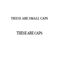
This is a more extreme example, but see how different they look?
The small caps all stay at the same level, they look nice, they look comfortable.
In contrast the capitals show some really big size and scale differences and look a little wonky all together. The S in “THESE” looks like it’s shorter than the other letters.
In contrast the capitals show some really big size and scale differences and look a little wonky all together. The S in “THESE” looks like it’s shorter than the other letters.
*Both these fonts are from Filosofia, from the designer Zuzana Licko.
Zuzana Licko is my first graphic design hero. She has been making amazing, unique and different looking graphic design for a very long time. I found her in one of the graphic design books my brother gave me, although I think I had already downloaded some of her fonts by that time because they look so great.
I don’t know a lot about her yet, but I’ve been looking through this app called Emigre Fonts. Emigre is a magazine that Licko and her husband made for a long time, and it’s very interesting and inspiring to look through! The app lets you download and view all the old issues. I’ll be studying it for a while!
There’s a lot of really funny and interesting old typography history that I’d like to write more about at some point, but it will have to be another post because I’ve really gotta get back to studying and becoming friends with Illustrator.
Here's a song to make you smile. Don't you want to wear a leather jacket now?